Shangbo Brand | Spreading Visual Image and Creating Gold Brand
In order to further enhance the cultural soft power of Shanghai Museum and expand its brand influence, in May 2019, the global competition for Shanghai Museum logo was launched. After half a year’s collection, in November, 2019, after the evaluation of experts in graphic design field and staff in the museum, especially experts and library leaders, our library announced the final winners of this competition through official WeChat, Weibo and official website.
At the beginning of this year, our library invited well-known design institutions to deepen the design of the works that won the first prize, and solicited the opinions of experts and staff representatives again. After several revisions and improvements, the new logo was born in September this year. The Visual Image Manual of Shanghai Museum (Chinese-English version) was completed after supplementing the unique auxiliary colors of the museum. The Manual standardizes the overall visual image design of Shanghai Expo, which can better spread the concept of the museum and further enhance the identity and influence of the Shanghai Museum brand.
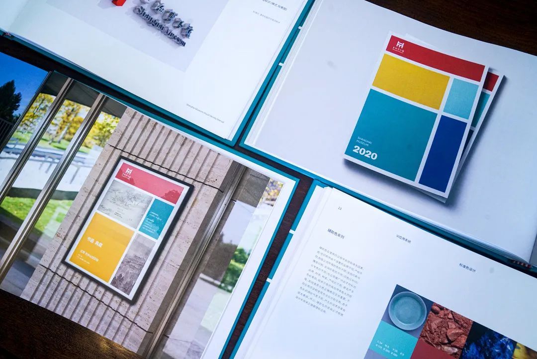
The logo graphic of Shanghai Museum takes the concept of Ding of Shanghai Museum as the breakthrough point, and combines the modeling characteristics of Dakeding, the treasure of the town museum, to form the morphological characteristics of Ding with minimalist lines. The graphic is concise and clear at a glance, and at the same time echoes the simple and modern architectural appearance of the East Pavilion. The graphic is ingeniously blended with the pinyin initials "H" of "Sea" and the English initials "M" of "museum", and the whole logo is also a combination of "H" and "M", which reflects the regional and international nature of Shanghai Museum.
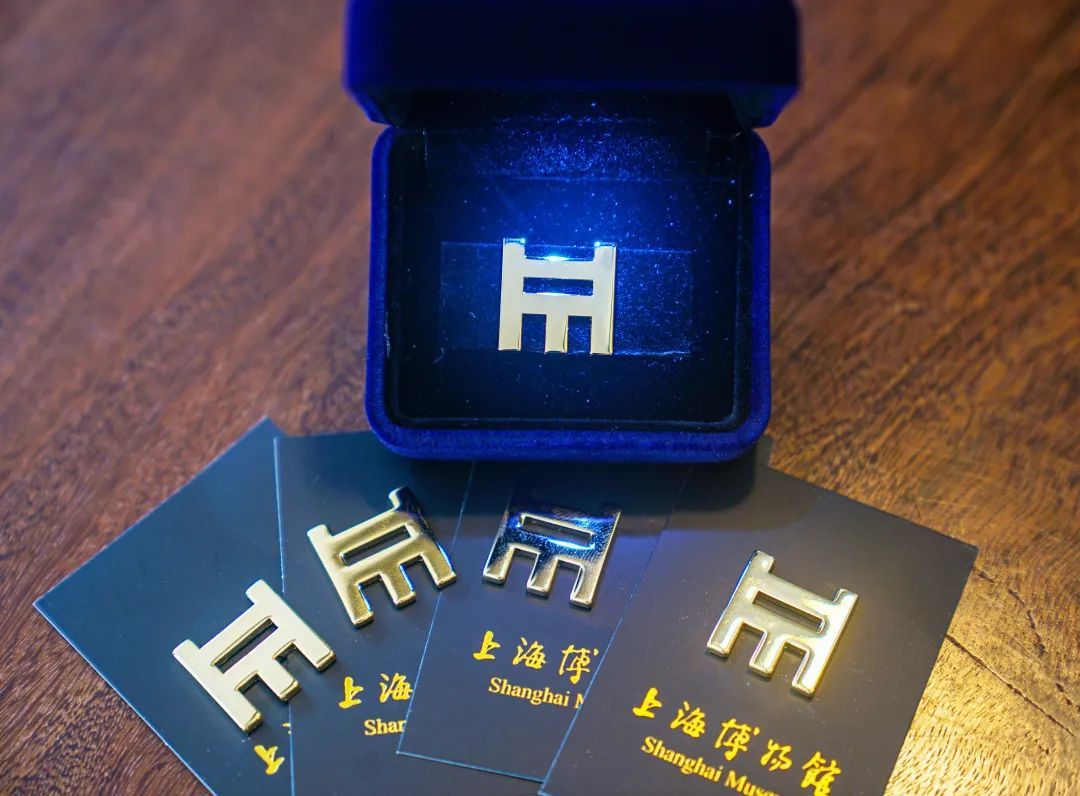
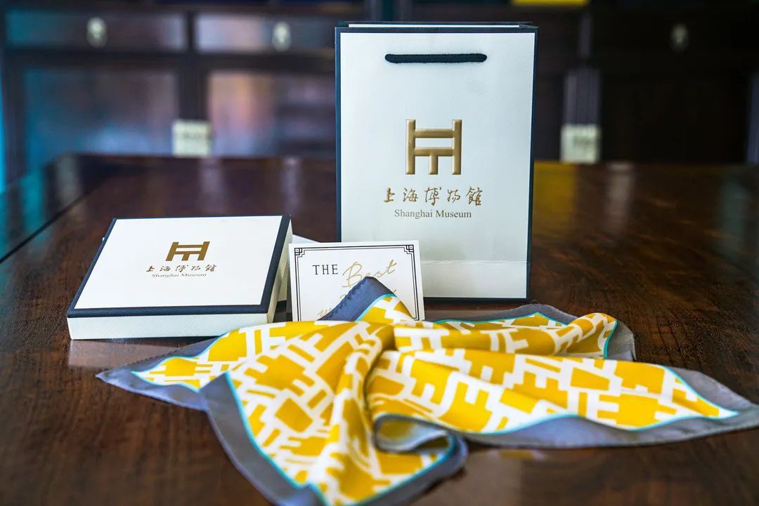
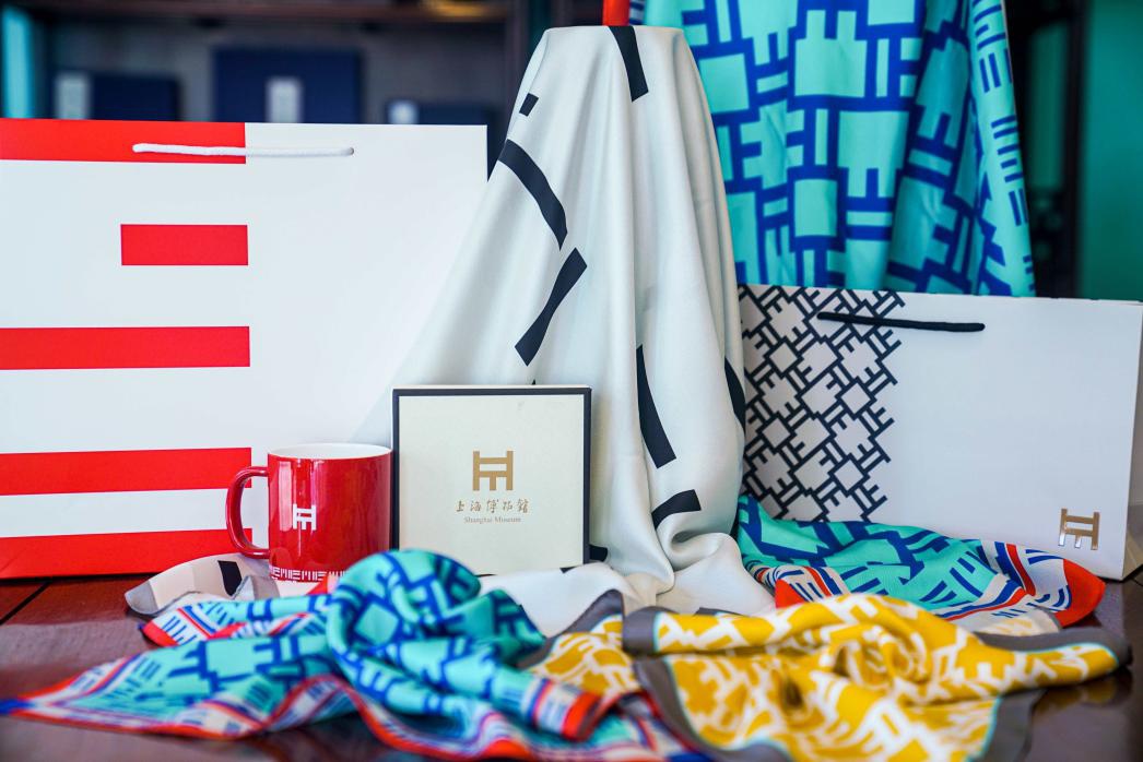
In order to further promote the image communication and brand promotion of Shanghai Museum, in October this year, according to the relevant specifications of derivative design in the Visual Image Manual of Shanghai Museum, our library carefully produced new logo badges, labels, and derivatives such as scarves and paper bags derived from the new logo patterns.
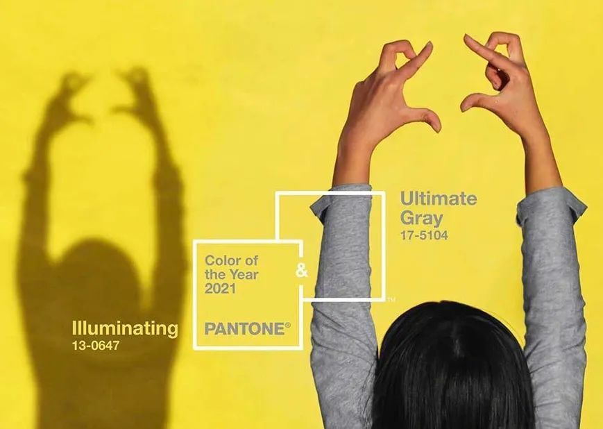
The design of the logo silk scarf of Shanghai Expo predicts in advance the international fashion colors of next year-extreme gray and bright yellow, which means brilliance (gray+yellow), that is, Shanghai Expo will continue to create brilliance.
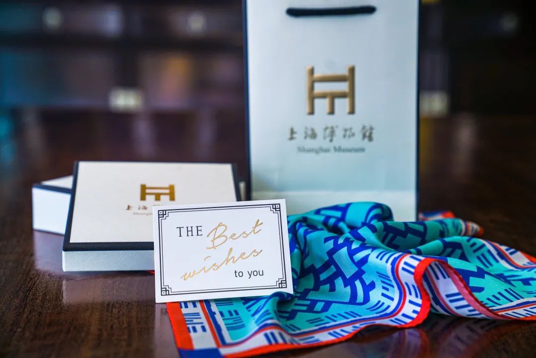
Based on the design of the new logo, the silk scarf uses international design techniques with extreme colors and simple lines to outline the rich connotation and artistic expression of the new logo, which fully embodies the international style of Shanghai Museum and highlights the elements of China and Shanghai characteristics.
The silk scarf is made of the finest 100% mulberry silk, which is produced by digital printing and dyeing technology. The texture of the fabric is fine and the color reproduction is pure and exquisite. With the packaging of international fashion atmosphere, the overall quality and commitment of the products produced by Shanghai Museum will be excellent.
The clear spring scenery of youth
Fresh and bright colors
Let people never forget.
Blue elegance and red enthusiasm
The air is filled with the brilliant joy of spring flowers.
Poetic autumn colors
Jumping bright yellow and gray
Warm, relaxed, fresh and sweet
Fashion is versatile and energetic.
Reflect the poetic rhyme of autumn.
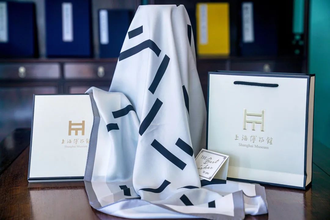
Elegant and quiet winter colors
Mysterious black and advanced gray.
Just the right level
Noble, elegant, steady and low-key
The eternal quiet winter is beautiful.
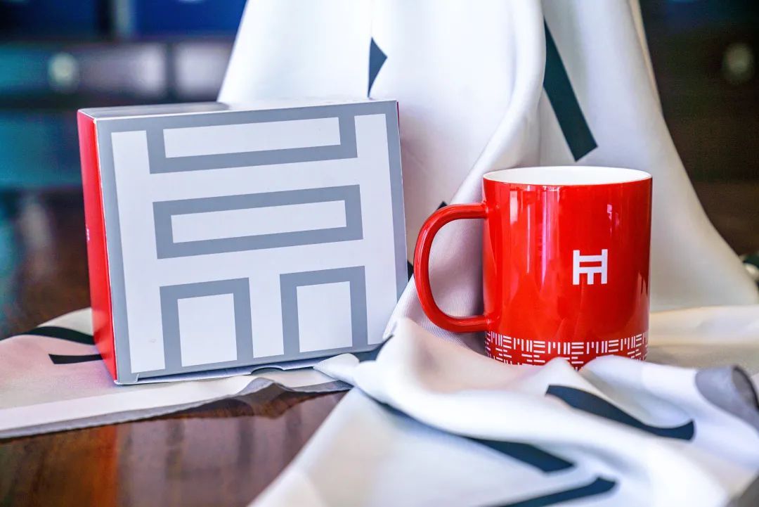
The new year is coming, and the Shanghai Museum has also designed a logo mug based on the main color of the logo, Lang Yaohong, which means that the business of Shanghai Expo will continue to flourish in the new year.
The mug is made of 45% imported high-grade bone powder, 21 extreme processes, 3 times high-temperature firing, and 5 times rigorous quality inspection, which is environmentally friendly and reliable. The mug porcelain of Shanghai Expo Museum is as smooth and delicate as sheep fat, elegant and red in glaze color, thin and smooth in matrix, smooth and wear-resistant, fine, transparent and free of impurities. The lower edge of the mug is specially baked with the three-dimensional touch of the logo, which shows the luxurious atmosphere. The design of the packaging box comes from the design of the paper bag of the new pavilion. The gray color is matched with the red color matching, which echoes the Lang Yaohong mug. The pavilion logo on the gray surface is concise and clear, and it is integrated with the packaging box.
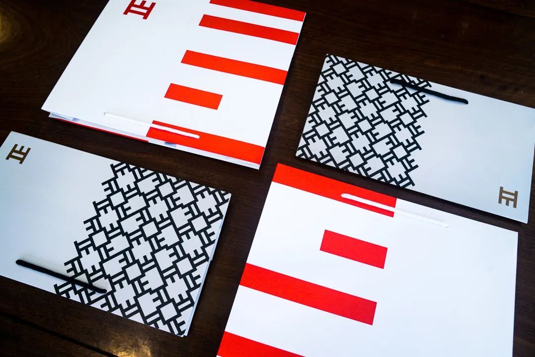
This time, the derivative products were designed and manufactured with gray and red logo paper bags, which were fashionable in gray and rich and jubilant in red. Both paper bags are waterproof and coated. The gray paper bag is suitable for holding all kinds of small and exquisite articles, while the red paper bag can hold 1-2 hardcover catalogs of museums.
The vi visual image design of Shanghai Museum is a powerful measure to effectively spread the concept of the museum and enhance the identity and influence of the Shanghai Museum brand. In the future, Shanghai Museum will develop more peripheral products according to the visual image of Shanghai Expo, and the products such as silk scarves introduced at present will be listed soon. Here, thanks to the audience’s warm feelings and long-term concern for Shanghai Expo, Shanghai Expo people will forge ahead, make great efforts, create more brilliant achievements, provide more meticulous and thoughtful services, and constantly meet the cultural pursuit of the general public and the audience.
copyright statement
The pictures and texts published by Shanghai Museum (micro-signal: Shanghai Museum) are all copyrighted works, which are only for the reading reference of subscribers. If you need to reprint other websites, clients and WeChat accounts, please contact us for authorization and indicate the copyright information of "Shanghai Museum". Thank you!
Tel: 021-63723500
Shangguan author: Shanghai Museum